CSS Tricks 2024


OS Version Android [.apk]: Download here
CSS is a versatile and powerful language that offers countless possibilities for creating visually stunning and responsive websites. By mastering essential CSS tricks like Flexbox, CSS Grid, Variables, Transitions, Animations, and Media Queries, developers can elevate their skills, streamline their workflows, and build immersive web experiences that captivate users and stand out in the digital landscape.
In the vast landscape of web development in 2024, CSS (Cascading Style Sheets) stands as a powerful tool for shaping the visual aesthetics and layout of websites. While its fundamentals are relatively straightforward, mastering CSS can unlock a world of creative possibilities and efficiency. In this blog, we'll delve into five essential CSS tricks that every developer should know to enhance their skills and productivity.
| No. | Contents |
|---|---|
| 01. | Backdrop Filter |
| 02. | Clip-path property |
| 03. | Compositing and Blending Level 1 |
| 04. | CSS Values and Unit Level 3 |
| 05. | CSS Anchor Positioning |
No.1 Back-drop filter
The backdrop-filter property in CSS is used to apply graphical effects like blurring or color shifting to the area behind an element. This property is commonly used to create frosted glass or blurred backgrounds for elements such as modals, sidebars, or navigation menus. Here's how to use backdrop-filter:
Note:- The backdrop-filter property applies effects to the area behind an element, so it may not work as expected if the element's background is transparent or has limited content behind it.
- Using backdrop-filter can have a performance impact, especially when applying heavy effects like blur, so use it judiciously, particularly on large or complex elements.
- Be mindful of accessibility considerations when using backdrop-filter, as heavily blurred backgrounds can make text and content difficult to read for some users.
- Overall, the backdrop-filter property is a powerful tool for creating visually appealing and immersive user interfaces in CSS, allowing you to add depth and sophistication to your designs with minimal effort.
Property Types
- Filter Effects:
- blur(): Applies a blur effect to the background.
- brightness(): Adjusts the brightness of the background.
- contrast(): Adjusts the contrast of the background.
- grayscale(): Converts the background to grayscale.
- hue-rotate(): Rotates the hues of the background.
- invert(): Inverts the colors of the background.
- opacity(): Adjusts the opacity of the background.
- saturate(): Adjusts the saturation of the background.
- sepia(): Applies a sepia tone to the background.
No.2 Clip-path property
The clip-path property is well-supported in modern browsers, but some older browsers may have limited support or require vendor prefixes. It's important to test your CSS code across different browsers to ensure compatibility.
Overall, the clip-path property is a powerful tool for creating visually striking and unique designs in CSS, allowing you to create complex shapes and effects that were previously difficult or impossible to achieve with basic CSS techniques.
By using these shapes and experimenting with their properties, you can create visually interesting and unique clipping regions for your web elements.Note: Not an actual code but syntax of clip-path property could be used on different elements
Code
.element {
clip-path: circle(50%); /* Circle with radius 50% */
clip-path: ellipse(50% 30%); /* Ellipse with width 50% and height 30%
*/
clip-path: polygon(50% 0%, 100% 50%, 50% 100%, 0% 50%); /* Diamond shape
*/
clip-path: inset(20% 10% 20% 10%); /* Rectangle with rounded corners
*/
clip-path: path('M 50,0 L 100,100 L 0,100 Z'); /* Triangle shape */
}
No.3 Compositing and Blending Level 1
Compositing and blending features are supported in modern browsers, including Chrome, Firefox, Safari, and Edge. However, browser support may vary for specific blending modes and properties. It's essential to check compatibility and provide fallbacks for older browsers if necessary.
The mix-blend-mode property The blend mode defines the formula that must be used to mix the colors with the backdrop. This behavior is described in more detail in Blending.
Code
.overlay {
background-color: rgba(255, 0, 0, 0.5); /* Semi-transparent red */
mix-blend-mode: overlay; /* Blend mode */
}
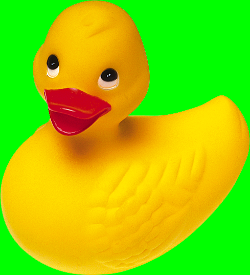 Given the following sample markup:
Code
<body> <img src="ducky.png" /> </body> <!--- And the following style rule: body { background-color: lime; } ... will produce the following result:-->
 Given the following sample markup:
Code
If we change the style rule to include blending: body { background-color: lime; } img { mix-blend-mode: multiply; } ... the output will be the image blending with the lime background of the <body> element.
No.4 CSS Values and Unit Level 3
In CSS, values and units are used to specify various types of measurements, sizes, colors, and other properties. Understanding the different values and units available in CSS is essential for controlling the appearance and behavior of elements on a webpage. Let's explore some common CSS values and units:
1. Length Units: Length units are used to specify distances, sizes, and dimensions. Some common length units include:
px (Pixels): A pixel is a single dot on a screen. It's a fixed-size unit that represents the smallest unit of measurement in CSS.
em: The em unit is relative to the font-size of the parent element. For example, if the font-size of the parent element is 16px, 1em is equal to 16px.
rem: Similar to em, but relative to the font-size of the root element ( ). This ensures consistency across the entire document, regardless of nesting.
% (Percentage): The percentage unit is relative to the size of the parent element. For example, 50% means half the size of the parent element.
vw, vh, vmin, vmax: Viewport-relative units. vw represents 1% of the viewport width, vh represents 1% of the viewport height, vmin is the smaller of vw or vh, and vmax is the larger of vw or vh.
2. Color Values: Color values are used to specify colors for text, backgrounds, borders, and other visual elements. Common color values include:
Named Colors: Predefined color names such as red, blue, green, etc.
Hexadecimal: Hexadecimal color codes in the format #RRGGBB, where RR, GG, and BB represent the red, green, and blue components respectively.
RGB: RGB color values in the format rgb(red, green, blue), where each component ranges from 0 to 255.
RGBA: RGBA color values are similar to RGB, but with an additional alpha channel for transparency. It's in the format rgba(red, green, blue, alpha), where alpha ranges from 0 (fully transparent) to 1 (fully opaque).
3. Font Values: Font values are used to specify font properties such as font-family, font-size, font-weight, etc. Some common font values include:
Font Family: Specifies the typeface of text. It can be a specific font name or a generic font family such as serif, sans-serif, monospace, etc.
Font Size: Specifies the size of the font. It can be specified in length units like px, em, rem, %, etc.
Font Weight: Specifies the thickness of the font. It can be normal, bold, bolder, lighter, or specified as a numeric value (100 to 900).
4. Positioning Values: Positioning values are used to specify the position of elements within a document. Some common positioning values include:
Static: The default value. Elements are positioned according to the normal flow of the document.
Relative: Positions the element relative to its normal position. It's offset using properties like top, right, bottom, left.
Absolute: Positions the element relative to its closest positioned ancestor. If none, it's positioned relative to the initial containing block.
Fixed: Positions the element relative to the viewport. It remains fixed even when the page is scrolled.
Sticky: Positions the element relative to its containing block based on the user's scroll position. It acts like a combination of relative and fixed.
No.5 CSS Anchor Positioning
Understanding CSS anchor positioning is essential for creating well-structured and visually appealing websites. By leveraging CSS properties like display, float, position, and others, developers can control the layout, alignment, and behavior of anchor elements to enhance the user experience and achieve desired design outcomes. Experiment with these techniques to find the best approach for your specific project requirements
This specification defines 'anchor positioning', where a positioned element
can size and position itself relative to one or more "anchor elements"
elsewhere on the page.
CSS is a language for describing the rendering of structured documents (such
as HTML and XML) on screen, on paper, etc.
By default, anchor elements are inline elements, meaning they flow along
with the surrounding text.
Tag Name : anchor
Applies to: All elements that generate a principal box
Value & order: As specified as grammar
Animation type: discrete
Display 'Types': Inline | Block
Position 'Types': Absolute | Fixed | Relative
inset-area = [
[ left | center | right | span-left | span-right
| x-start | x-end | span-x-start | span-x-end
| x-self-start | x-self-end | span-x-self-start | span-x-self-end
| span-all ]
||
[ top | center | bottom | span-top | span-bottom
| y-start | y-end | span-y-start | span-y-end
| y-self-start | y-self-end | span-y-self-start | span-y-self-end
| span-all ]
|
[ block-start | center | block-end | span-block-start | span-block-end |
span-all ]
||
[ inline-start | center | inline-end | span-inline-start |
span-inline-end
| span-all ]
|
[ self-block-start | self-block-end | span-self-block-start |
span-self-block-end | span-all ]
||
[ self-inline-start | self-inline-end | span-self-inline-start |
span-self-inline-end | span-all ]
|
[ start | center | end | span-start | span-end | span-all ]{1,2}
|
[ self-start | center | self-end | span-self-start | span-self-end |
span-all ]{1,2}
]
An absolutely-positioned element can use the anchor-size() function in its sizing properties to refer to the size of one or more anchor elements. The anchor-size() function resolves to a length.
anchor-size = width | height | block | inline | self-block | self-inline
The anchor-size() function uses the same parameters as anchor(); the only
difference is that the keywords are changed to denote the separation between
two opposing sides.
The target anchor element's width and height are denoted by the physical
keywords "width" and "height," respectively. The axises do not have to
match, unlike anchor(); for instance, width: anchor-size(--foo height); is
allowed.
The writing modes of the element (for self-block and self-inline) or the
contained block (for block and inline) determine which of the physical
keywords the logical keywords (block, inline, self-block, and self-inline)
map to.
By using style and layout interleaving, an anchor-size() function that
represents a valid anchor-size function resolves to the separating the
relevant border edges (either left and right, or top and bottom, whichever
is in the specified axis) of the target anchor element.
D
Dave Jones
★★★★★ 16/03/2002
I'm better at web design now. I learned a lot of things I didn't know here. I hope I can do better in the future. Thanks.
C
Chris Brown
★★★★★ 16/03/2002
I love the extra features of the app.
See all reviews
Similar Apps
App 1
4.3 ★
App 2
3.9 ★
App 3
4.1 ★
App 4
4.5 ★
App 5
4.9 ★
App 6
4.2 ★
Blog information
- Category: Web Development
- Client: None (Personal Project)
- Project date: 10 November, 2022
- Written By: Mohan Yadav
B Math
Mohan Yadav
4.6 ★
10k reviews
↓
4.8 MB
100K+
Download
B Math is an intregrated calculator, that can even calculate factorials, square roots and other relevant content . It even contains new features for non-linear calculations that are difficult to type on your browser. Even simpler to apply without any difficulties for finding symbols on software keyboards.
| Operating System | Size | Technology | Licence |
| Android | 2.36 MB | Java XML Kotlin |
None |
4.6
★★★★★
10.178
A
Alexa Wilson
★★★★★ 16/03/2002
Nice app. Examples and lectures are good.